|

At Rex 3 we understand your brand colors are an essential piece of brand recognition and a key aspect of a successful packaging campaign. Consistent and vibrant colors work in combination with your logo and tagline to attract, engage, and reinforce a positive connection with your brand. So if colors, and we mean, your exact Pantone-to-the-particle colors, are vital, why is color consistency packaging design such a common source of frustration? You're tired of hearing jargon and are ready for the facts.
The value of a strong brand:
- Adds value to the company: Enhances your company's worth.
- Reaffirms Quality: Strengthens perceptions of quality.
- Builds Trust: Fosters trust between your brand and customers.
- Improves Recognition: Boosts consumer recall and recognition.
- Differentiates: Sets you apart from competitors.
These benefits highlight why maintaining color consistency in your packaging is essential. If it is not treated with the care and quality it deserves, your brand will suffer. This is even more true for brands that sell products in colorful packaging designs.
Color Consistency and Packaging Design
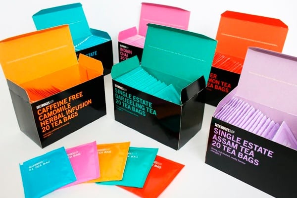
If you're creating packaging for nutraceuticals or cosmetics, your packages must stand stand-outs on store shelves, and certainly, brand recognition is key. Your brand colors play a key role. Modern marketers use a wide array of strategies and tactics, digital and print, and every piece, from direct mail campaigns to brochures to sales kits and catalogs must reinforce the brand experience. Your colors, again, play a key role.
How colors are created in packaging design
Colors are created by combining other colors. Red Green and blue are additive color primaries for tvs and monitors. Start with black add RGB, get all colors, and eventually white.
Print Colors
In printing, we use Cyan, Magenta, Yellow, and Black. Start with white paper and add CMYK to achieve all colors and eventually solid black. That's a very loose explanation of how colors are made for commercial print materials like folding carton packaging or company collateral, but we've hit on an important aspect of creating color – -mixing. There's a recipe or formula for creating every color. If it's not followed precisely, Pantone problems abound!
There are only a few commercial presses available today with the level of color control precision your colors deserve and your brand needs.
How to Achieve Color Consistency on Your Packaging Designs?
While your print project is running on the offset press or digital press, many, many calculations are happening all the time, synchronizing the movement of the sheet feeder, ink wells, coatings, and finishes, plates, and rollers.
Sophisticated presses like our L 106 and our HP Indigo 7900 have the best color control technology available today. Superior color scanning technology constantly monitors for color consistency during the press run and makes instant adjustments. In the case of the HP Indigo 7900, the color precision is so on point that it is measured by the pixel!
Getting true colors, your brand colors, every time is not just a preference. In commercial printing and packaging design, this is essential. At Rex 3, color consistency is one of our commitments to you.
Your Brand's Palette matters and it is Our Priority
Achieving true brand colors in packaging design is not a mere preference—it's essential. At Rex 3, we understand the importance of color consistency and are dedicated to delivering it with every project. Your brand's integrity and recognition depend on it, and we're here to ensure your packaging reflects exactly what your brand stands for.
Contact Rex 3 today to make your brand's colors consistent across all your packaging designs.