
There’s no denying the importance of proper branding for your company or organization, especially designing a logo that effectively communicates the purpose of your being. It’s the face of your organization printed on everything from consumer packaging to promotional materials and displayed everywhere online. And within the design process comes the decision to choose the right colors for your brand. According to Marketo, studies have proven a brand’s color actually influences 60 to 80 percent of a consumer’s purchasing decision. Therefore, it’s less about what may seem “cool” or trendy at the time and more about your brand’s messaging.
While different colors trigger different emotions in each culture, studies suggest there are universal meanings tied to color association. We gathered four well-known brands and broke down their color choices and the universal meanings attached to them.
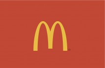
Everyone’s familiar with McDonald’s famous golden arch. This yellow catches people’s attention and is oftentimes associated with positivity and light. Red, on the other hand, signals a more passionate response, which makes it more attention-grabbing and exciting. The combination of the colors works well for McDonald’s because they are a fast-food chain. They need a logo which will grab consumers’ attention and lead them to their locations above all other dining options.
Other fast-food chains that use yellow and red: Wendy’s, Johnny Rockets, and Sonic.
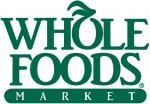
Whole Foods is known for supporting and promoting organic farming and sustainable agriculture. Whole Foods also protects the environment by supporting alternative sources of energy and by composting waste. Green evokes calmness, serenity and freshness. Since Whole Foods’ mission is to be environmentally-conscious and provide consumers with high-quality, healthy products, branding themselves with the color green helps portray their goals.
Other brands with green logos: Starbucks, Kashi, and Subway.
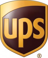
UPS is one of the world’s most trusted brands enabling commerce around the globe. Their brand colors are brown and yellow. From what we’ve discussed previously, yellow evokes positivity and hope. Brown, on the other hand, evokes strength and durability. Both of these traits are the perfect match for a brand caring for your packages in transit. Since UPS transports goods every day, it’s imperative they’re seen as a trusted brand. When these two colors are combined, they’re effectively communicating UPS’ trusted global services.
Other brands with brown logos: Louis Vuitton, DoubleTree by Hilton, and Cotton.

Twitter is the second-most used social media network in the world. Finding a color that matches their core values is vital to their success. Twitter’s logo is blue which is one of the most widely used colors for branding because it’s perceived as open, relaxed, secure and efficient. Just like Facebook and Wordpress, the blue hues help these websites retain users because they’re perceived as “open” and “relaxed.” If they had chosen a warm color like red their logos probably wouldn’t be perceived as friendly and open-minded.
Other brands that use the color blue: PayPal, Chase, and Facebook.
These are just a few examples exemplifying how colors impact brand identity, but the message is clear; it’s imperative to think strategically when considering your brand’s colors. Are they successfully communicating your brand’s overall goals and values? And is your team successfully marketing them? Our team can produce your marketing collateral ranging from brochures to packaging to integrated direct mail marketing while leveraging over 60 years or commerical print and packaging experience to perfectly match your brand’s color identity. Interested in learning more? Contact us.