Five Do’s and Don’ts of Designing a Business Card

Here are five tips to help you design a business card that creates a lasting impression.
Having an impressive business card is one of the most important, and often overlooked, tools in marketing yourself and your company. Think about how many you hand out in a given year, or even in a month, and you’ll realize their significance in your daily life. They’re your right-hand man at networking events, social functions, business meetings, and even unplanned situations. Why? Because they’re the first step to creating a long-lasting relationship, and we all know that at the core of each successful business is the people and the relationships surrounding it. If you want to stand out from the crowd, do and don’t do these five things when designing your business card.
1. Don’t clutter. Of course you’re thinking about all the “pertinent” information you want to include on your business card. After all, it’s a way to sell yourself. There’s the logo, company name, tagline, your name, your title, website, office number, mobile number, fax number, address(es), email address, social media sites, and the list goes on. The standard business card is a piece of stock card that measures 3.5 inches by 2 inches. You can’t overcomplicate and clutter this small space with every possible piece of information and point of contact.
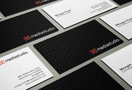
Do include your logo, company name, and your name along with legible contact information with just a few ways to reach you so you’re not being overwhelming. If you’re constantly on the go, opt to include your mobile phone number instead of your office. If you haven’t received a fax since 2002, it’s probably okay to omit that too. Social media is a great addition to the way we communicate. It can, however, become cumbersome to include every single social media URL and icon. In this instance, you could explore adding a QR code to your business card or include just your primary social media sites with your most loyal community.
2. Don’t use more than two fonts. Going back to our first point, more than two fonts will clutter your business card and make it difficult to read. Just like a well-designed website or an easy-to-navigate mobile app, you want your business card to be user-friendly.
Do vary the size of your fonts to call out specific sections and information such as your logo, company name, and your name. The rest of your contact information you choose to include should use a smaller font. Play around with re-sizing your text and choose the option that works best with the size and shape of your card.
3. Don’t get color crazy. You want to attract positive attention and avoid distracting your card reader. Colors are a great way to express your personality, but unless you’re in the creative industry, you should likely stick with two to three colors for your cardstock, fonts, and graphics. Again, you’re trying to avoid clutter.
Do use colors representative of your brand. Your company’s logo, brochures, website, social media, packaging, and business card should be cohesive and reflective of each other. Make it easy for people to recognize who you are and what you represent. After all, you wouldn’t expect to see blue and pink on a McDonald’s business card when everything else is branded yellow and red.
4. Don’t skimp on paper quality. Making a lasting impression with your business card doesn’t stop at visual appeal. The touch and feel of your business card will resonate with each person you hand it to. A thin and flimsy card may create the impression that your business is weak and unsuccessful whereas the opposite could reflect strength and dependability.
Do print differently. Choose a thicker cardstock like 16pt or 32pt. Consider the texture and how it represents your brand. Are you smooth and glossy or rough and matte? By investing in coating your card, you’re also investing in the lifespan of your card by protecting it from moisture and UV rays. Another factor you’ll want to consider is the shape and size of your business card. Will your corners be square or rounded? Will you opt for traditional 3.5” x 2” dimensions or choose something smaller like 2.75” x 1.10”? Heck, maybe your cards will be in the shape of a dog? Just remember to be unique while staying true to your brand.
5. Don’t settle. You are the first impression. Your business card is the last. When designing your business card, don’t settle for the first design because it gets the job done and avoids spending more of your hard-earned time and money. You will regret purchasing 1,000 mediocre business.
Do give yourself options by creating multiple designs. Ask your friends and colleagues for their input. You could even try crowdsourcing your designs through email and social media by asking your audience to vote on their favorite design. Not only will this help you choose your new business card, but it will nurture the relationships you have with your community because you’re allowing them to be part of the decision process.
Whether you’re designing business cards for the first time or the tenth time, there are many factors that need to be taken into consideration if you’re serious about creating long-lasting impressions and relationships. Need some assistance? Contact us, and we'll be happy to help.
