|

Typography is oftentimes overlooked, but it can essentially make or break your project’s design. There are typefaces created solely for print use and others made for digital monitors such as computers, tablets, mobile and television. More often than not, your biggest challenge is actually choosing the right font for your project. With the ever-increasing amount of font options, it can be an overwhelming decision. You also have to factor in spacing between characters and applying multiple fonts to your design. We understand this challenge in the design process which is why we’ve gathered up these 5 tips to better understand typography.
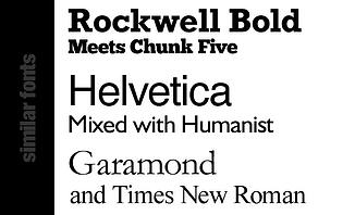
Serif vs. Sans Serif
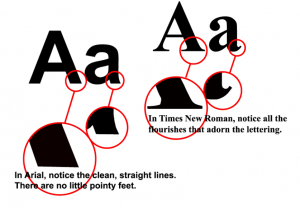
Serif fonts (shown right) have small lines adorning each letter. They’re frequently used in print media because of their readability which guides your eye from letter to letter.
Sans serif fonts (shown left) do not have any small lines adorning the font. These fonts are most commonly used for magazine headlines and websites. They’re also easier to read on digital screens. To further delve into the differences, check out this infographic on Web Designer Depot.
Kerning
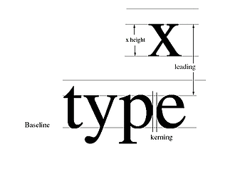
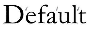
Kerning is defined as the spacing between two letters in a font (first photo below). All fonts are not created equal though. The font in the second photo below, for example, has some disproportionate kerning. If you’re designing logos or headers, pay careful attention to kerning to prevent any final printing errors.
Alignment
Alignment is just as important as typeface when it comes to creating an attractive design.
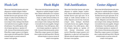
Flush left is most commonly used for increased readability seen in books and magazines. Its clear starting and ending points increase legibility.
Flush right is seen in Arabic and Hebrew text which is read right to left. In English versions, it’s also used to set off special text for attributions to authors, quotes in books and magazines, and to format tables and data.
Full justification is known to be more formal than flush left. It’s implemented when there needs to be a lot of text bunched into a tight space. Newspapers and newsletters are a good example. Although full justification appears to be more uniform than flush left, there can be kerning issues.
Center aligned is most commonly chosen by non-designers. It’s the most difficult to read and should be used selectively since there’s no defined beginning and ending points. We recommend using it with titles or logos.
Don’t forget to be consistent when designing. Experimenting by mixing and matching alignments can be the best solution to creating the most legible variation for your audience.
Choosing Secondary Fonts
If your project includes descriptive text, you’ll also need to incorporate a secondary font. Choosing this secondary font can prove to be even more challenging than the primary. A couple helpful tips: make sure the fonts blend well with each other and choose a secondary font that’s easier to read since it serves as an accent to the primary font.
Get inspired
As Charles Caleb Cotton once put it, “imitation is the sincerest form of flattery.” Browse the Internet, analyze print ads, and observe signs around you. Typography is everywhere, and you’re actually reading a form of typography right now. Mix and match ideas from successful campaigns and implement them into your next project.
The possibilities really are endless, and we can help you every step of the way from typography designs to printing techniques to color matching. Contact us for assistance with your next project.